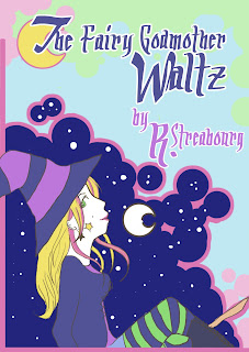
I like this song.. mostly because it gets my imagination going on about what sort of fairy godmother the composer was trying to conjure.
However, I wish that the cover was a little more inspiring!
Archive # 61
From what I can tell by looking at this, they would print the same cover for several pieces that have a theme. The theme could be a composer, era, or idea (like flowers, or waltzes for example), and whatever piece was that was contained within was underlined on the cover with either a pen or a color pencil. On the cover above, you can see the blue mark six songs down. I'm not sure if the sending or receiving company did this, but whoever had the job to do that probably was bored out of their mind! Hopefully, as I research more I will figure it who did the marking!
I think I may design a cover for this though, just for the fun of it. And... I think I may base it off of my costume for Halloween this year.

The outfit is a bit modern, yes, but I'm thinking it would be fun to make it look a bit art-nouvelle-y. The only thing is that most sheet music looks like it used multi-layered lithography, and I'm not sure how I want to address that. Limiting my color pallet, and using thick lines seems to be the obvious answer. But... but... but! I like lots of bright colors! What shall I do?
We'll just have to see. I have no doubt that the cover will look nothing like anything from the era of Tin Pan Alley, but I think it will be fun to do anyway.